Notes from Lauren:
- Move title from touching black panel
- Make lyric text larger and bolder
- Play around with placement of title and album cover
Notes from Arushee:
- Remove drop shadow from scroll bar
- Make title overlap with black panel like album (makes the bar seem more intentional)
- Incorporate the orange from the bottom text into the title
- Lyric text needs to be stronger/more dominant
- Play with serif font for the title (will tie in with text in bottom panel) and keep lyrics sans serif
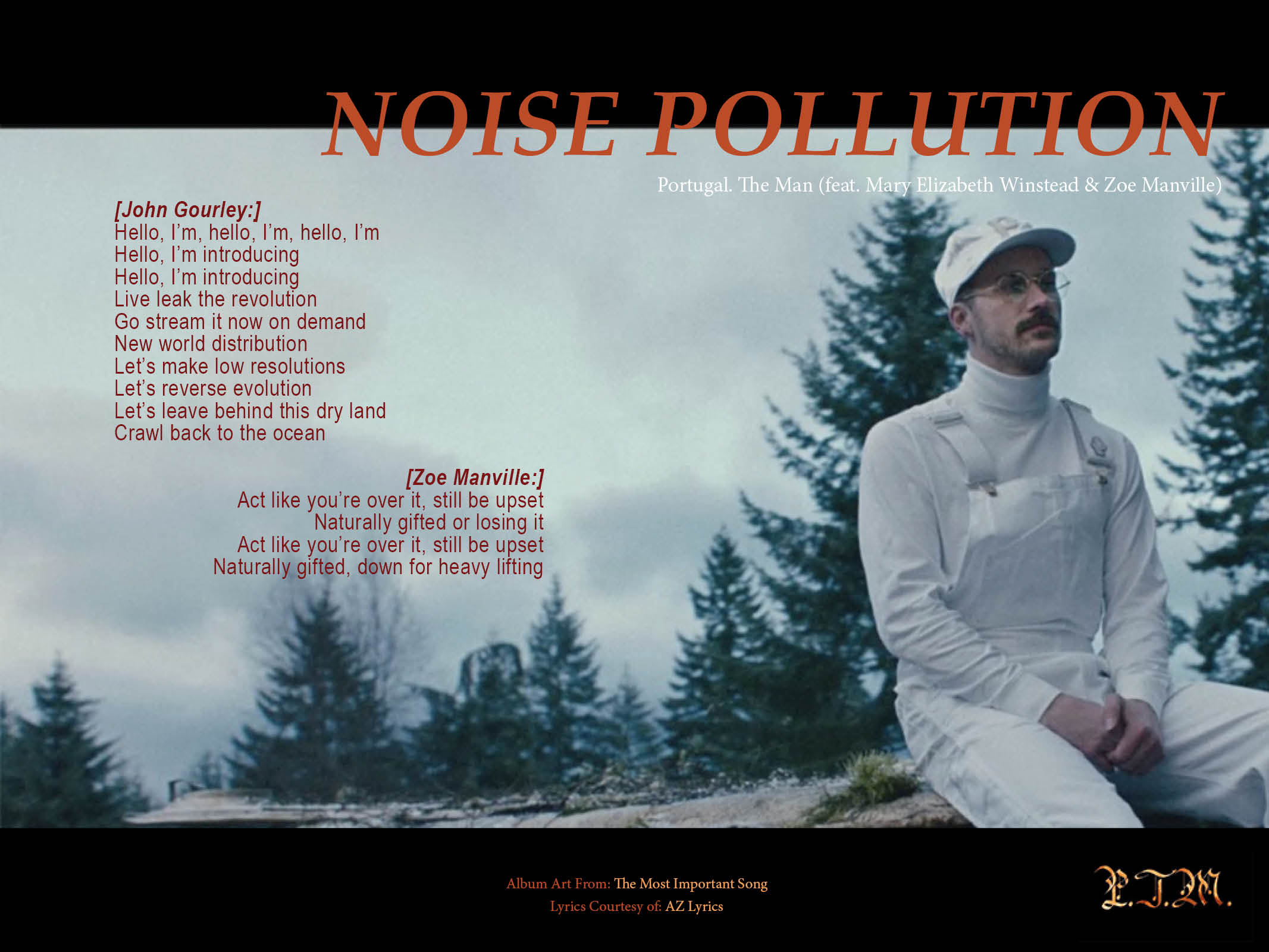
Original Mockup
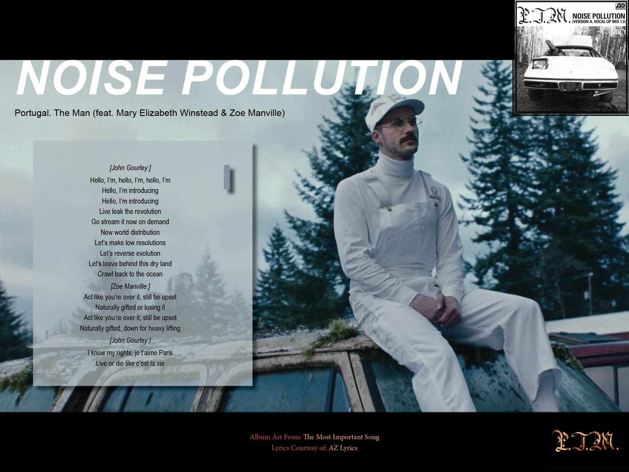
Revision
Plan on Using Pt Serif (in Bold 700 Italic) and PT Sans (in Regular 400) for the title and lyric fonts respectively
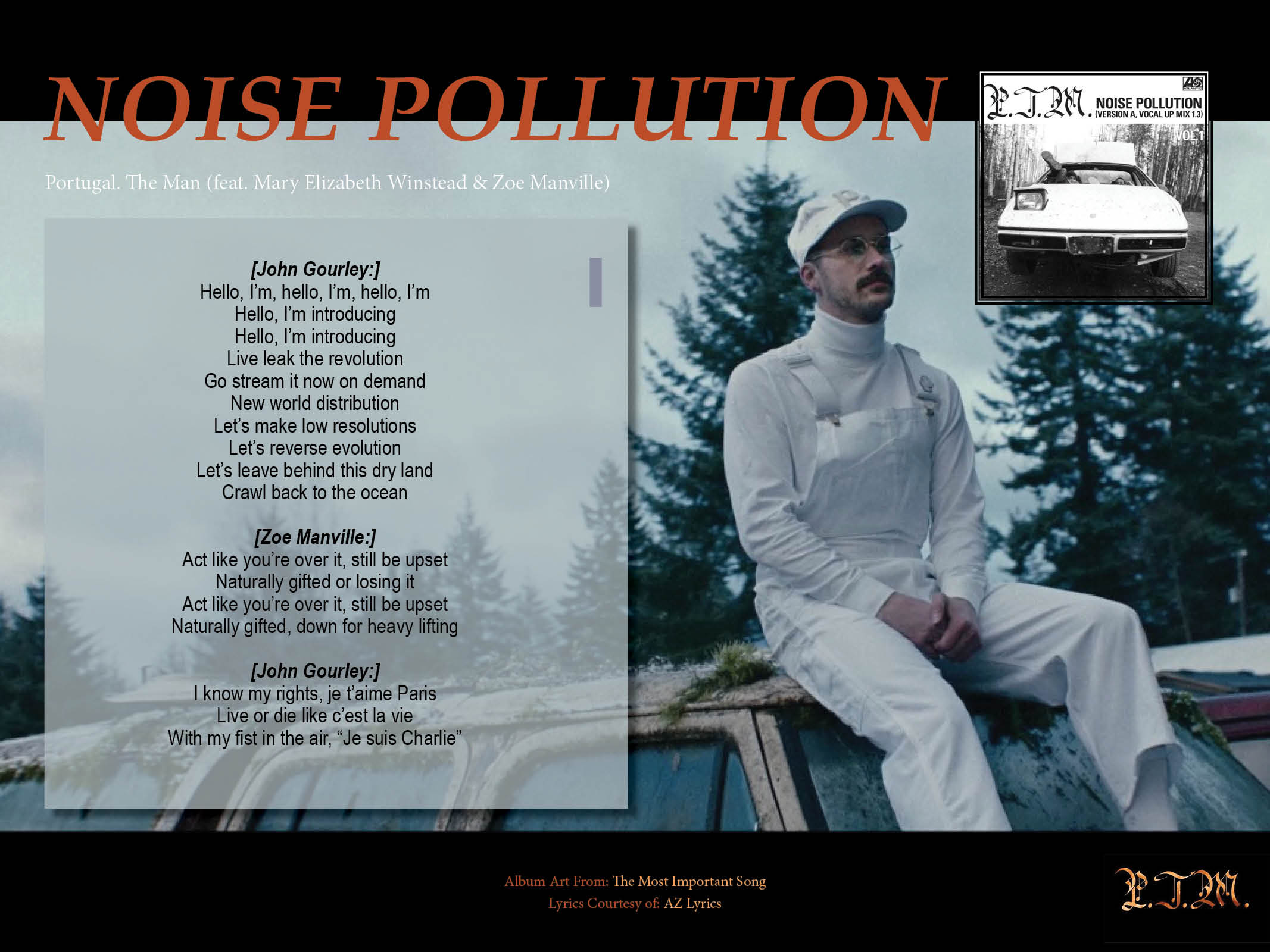
Revision 2
Plan on Using Pt Serif (in Bold 700 Italic) and PT Sans (in Regular 400) for the title and lyric fonts respectively